App redesign
Boticário Q4 2023
I started and completed this project by myself. The experience of the official Boticário app was always frustrating to me, as I'm sure it was to other people. I took matters to my own hand by trying to redesign their app while keeping their visual identity.
About the project
O Boticário is a nation-wide known beauty brand from Brazil that has been loved and cherished by their costumers since 1977. They sell perfumes, skincare, cosmetics, and even recently launched a new line for petcare.
However, while their physical products may be acclaimed, their mobile application leaves a bit to be desired. The application has a few confusing choises of usability and overall design.
The problems
The app had two main problems:
1. Different buttons that will take you to the same place. This not only makes the user confused, but also the application. Often times, when you click one of the similar buttons, the app doesn’t quite know where to take you, or where you have been.
2. The home area is filled with banners which act too similarly to ads. It also lacks the pleasure of scrollability. Items scroll horizontally and limited to the topics they highlight. It’s easy to find something if you’re specifically looking for it, but not to discover something new that is not in the first banners.
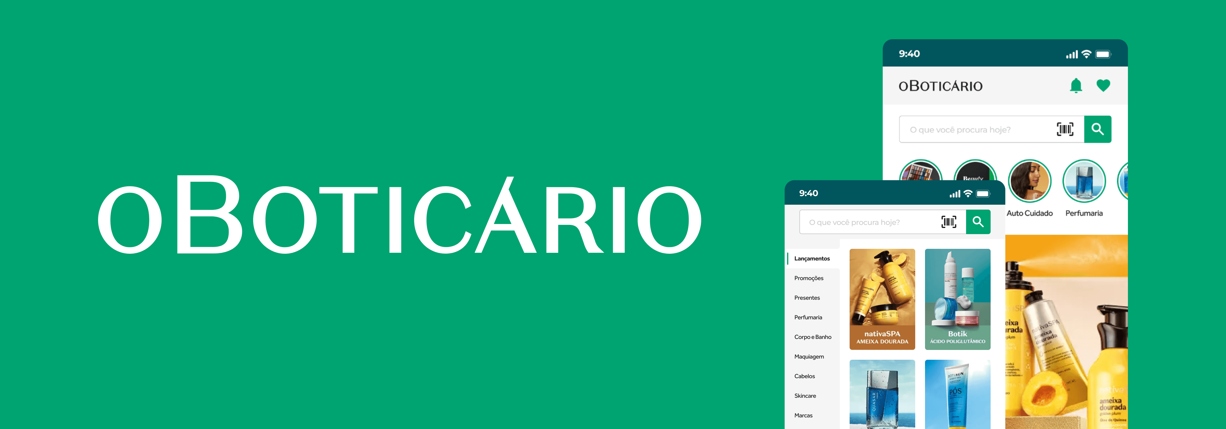
The redesign

The home screen was updated mainly with the redesign of their cards. With smaller and simpler cards, users can still view the most important information but with more products per scroll. Horizontal scroll was removed in favor of vertical scrolling.
Search and shopping bag buttons were removed from the top and moved to the footer in place of contact and profile, which were added to the menu. Icon for fidelity was also changed for better readibility.
The search feature only included a search bar and, by clicking the suggestions, it would show a search result for that entire category. Instead, inspiration was brought from their website, where they go into specifications for each category.
Users can more easily find what they want by searching on general or specific categories instead of searching for specific product. The banners that were taken from the home page were then placed on their own category on the search bar for launches. Their different format can grab the user's attention and gather more interactions.
The menu, which used to be a huge list of options for the user to go through, was changed into category buttons with icons to make it easier for the user to identify what they're looking for. Buttons that were in the original list that can already be found in other areas of the app, such as fidelity and likes, were removed.
view on figma


